Levelling up a custom mouthguard business
Problem
Rhino makes best-in-class custom mouthguards, but the website didn't reflect that or show the brand's wealth of experience, quality and value.
Solution
I led the design direction for a new website with an external agency, then kept improving the experience in small steps based on how people actually used it. Around that I pulled the brand together across print, packaging, custom client designs, ads and social.
Result
A clearer, easier website and a brand that feels consistent from the first ad through to the case in your kit bag, with ongoing improvements guided by analytics.
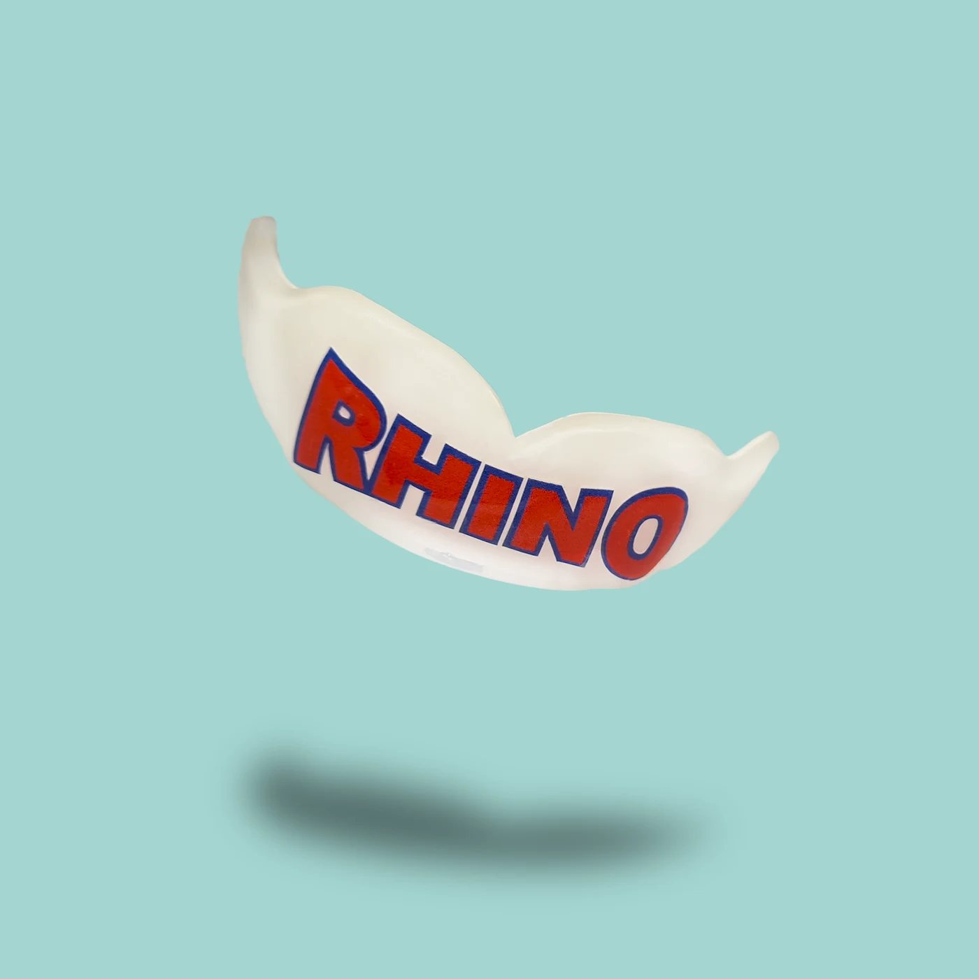
- 01
Show Rhino's 40+ years of experience, quality and value from the first screen.
- 02
Make it easy to choose between a clinic fitting and ordering from home.
- 03
Help people pick the right mouthguard without needing to call.
Business needs
- Grow online orders and home impression kits alongside clinic bookings
- Justify custom pricing by making the value clear
- Use athletes, gyms and clubs as proof of quality
User needs
- Know whether to visit the clinic or order from home
- Understand what's included and how the process works
- Compare options by age and sport, then buy with confidence
How might we make a best-in-class product look the part online, and make ordering something custom feel simple?
I wireframed the homepage to set the direction for the external agency, building it around two clear paths and the questions customers asked most.
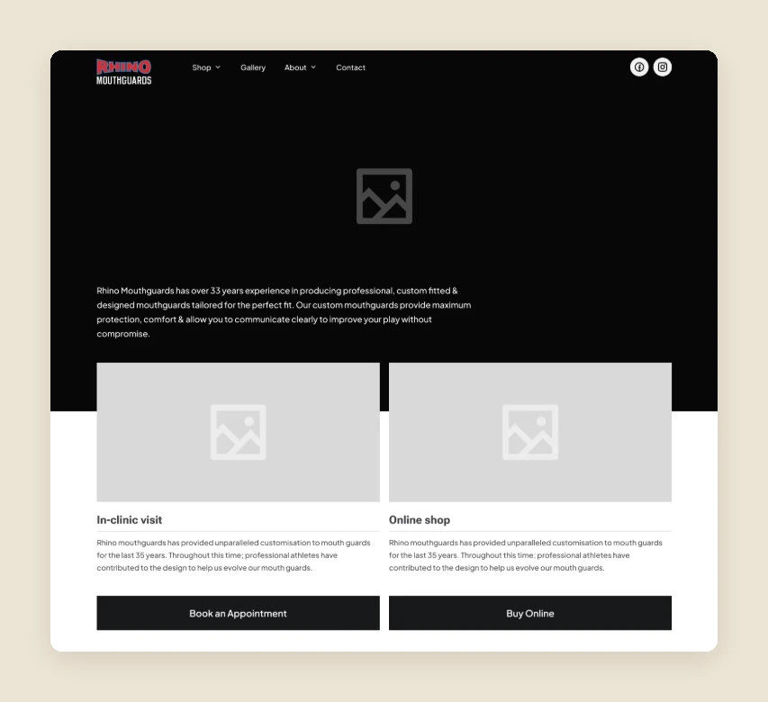
Book a fitting or buy online, offered side by side from the first screen.
Health-fund rebates, free adjustments, orthodontic options and mobile fittings, surfaced before price.
Three tiers by age and sport, with a best seller to guide the choice.
A simple five-step "How it works" so ordering from home never feels uncertain.
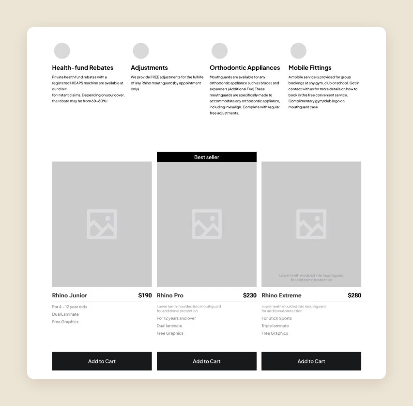
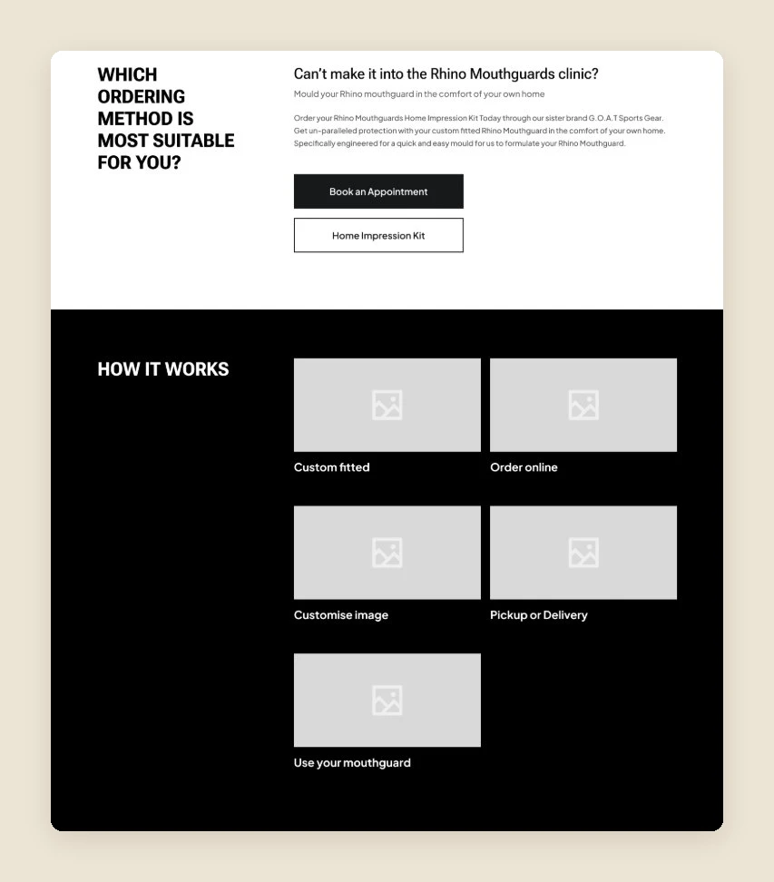
The agency brought the direction to life with Rhino's bold, athletic visual identity, keeping the structure from the wireframes.
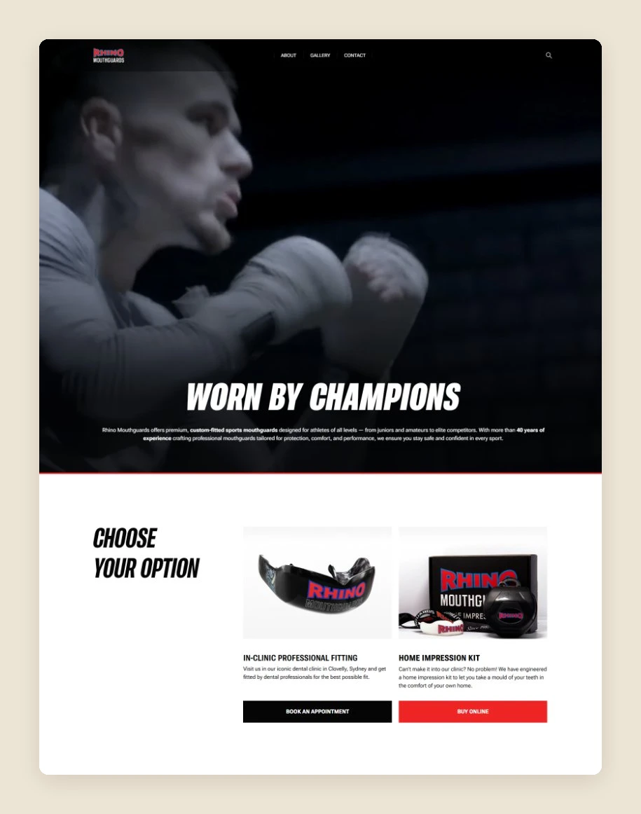
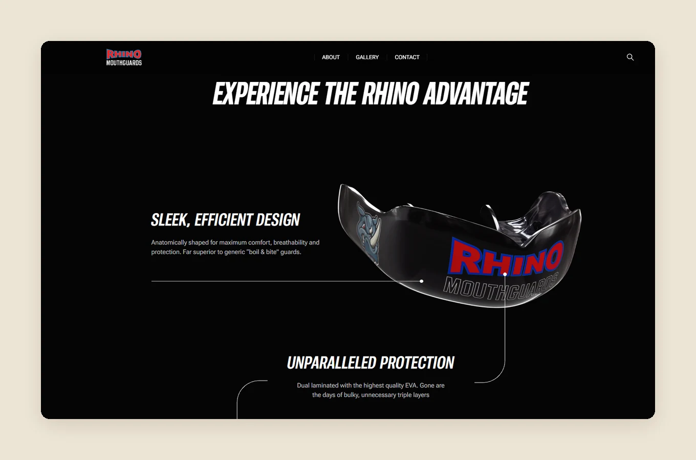
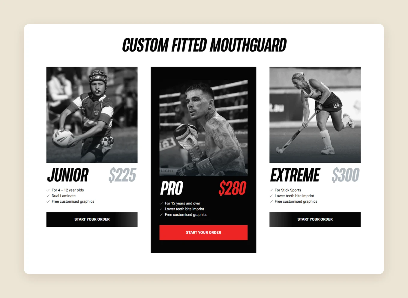
Once the site was live, I kept refining it in small steps based on analytics and how people actually used it.
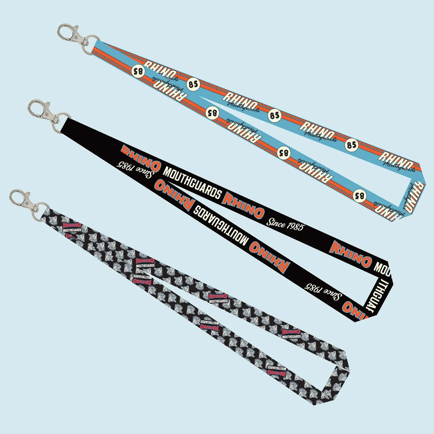
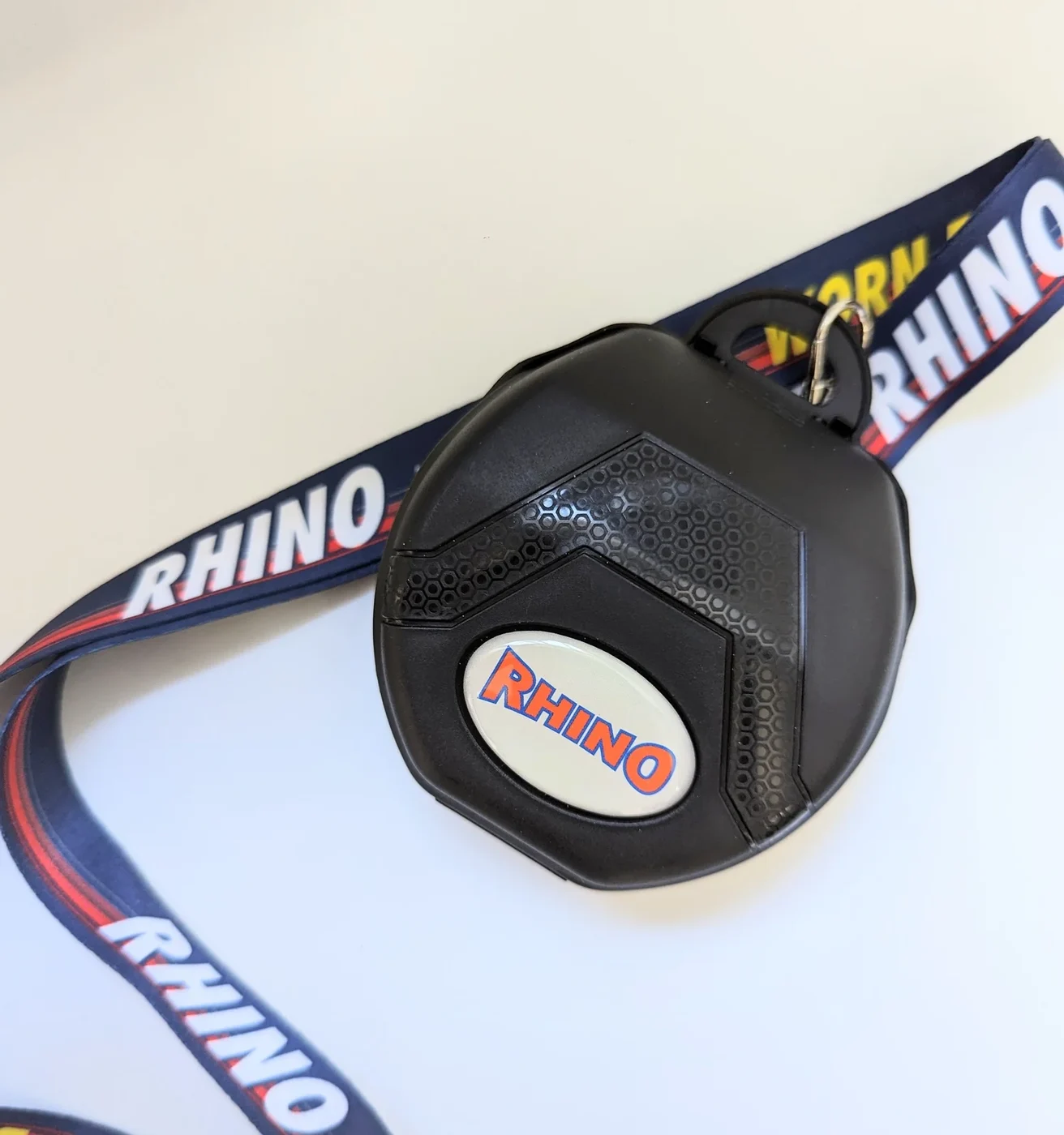
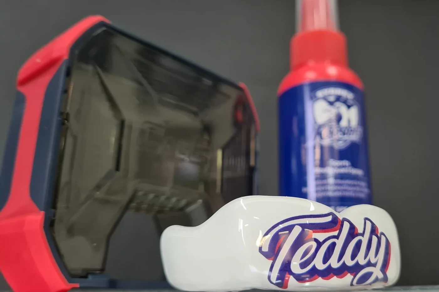
Every Rhino mouthguard is personalised. As a qualified dental prosthetist I know the product inside out, so I designed custom graphics for clients, from names and numbers through to full sponsor and team treatments, then carried that identity through the packaging, lanyards and cases.