Making investing and super feel simple
Problem
Investing and super feel complicated and high-stakes for most people, and Stockspot was launching a brand new super product from scratch. Existing funds tend to lose people at the fiddly moments, like entering a TFN, rolling over or choosing insurance.
Solution
An end-to-end super experience across a lead-gen page, signup, dashboard and app, held together by a design system I built and managed and shaped by user interviews and testing. I worked on every part of it, from UX and UI through to visual design. Alongside it, a Gold page that turned interest in a popular asset into a clear path into Stockspot Super.
Result
Launched with every touchpoint shipped, and I've helped it grow ever since.
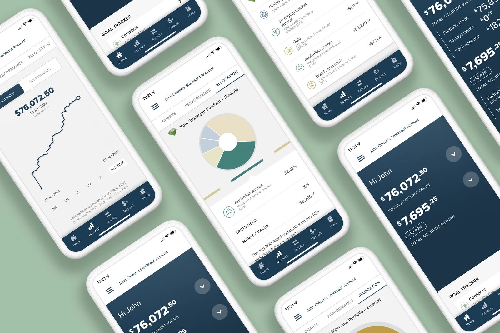
Designing the end-to-end superannuation experience
Stockspot Super was a brand new product inside the existing investment suite. Super is regulated, often misunderstood and high-stakes, so every decision had to balance compliance, trust and conversion with plain old usability.
Figures in screenshots have been altered for privacy.
- 01
Launch a complete super product: a lead-gen page, signup flow, dashboard and app.
- 02
Make a regulated, high-stakes product feel simple to join and manage.
- 03
Keep it unmistakably Stockspot across desktop, mobile web and app.
Business needs
- Turn organic and paid traffic into new members
- Meet regulatory and compliance requirements at every step
- Reach parity with the big Australian super funds
- Absorb requirements that kept evolving through the build
User needs
- Understand what they're signing up for, even if they've never heard of us
- Get through the fiddly parts like a TFN, rollover or insurance without stalling
- Always know where they are and what comes next
- See their account clearly, whether it's pending or fully active
How might we make joining and managing super feel simple, when the moments that matter most are exactly where people tend to drop off?
Every touchpoint had to be conceived, researched, designed and tested. Each had its own job, but together they needed to feel like one product.
A legally complex process across three different states. Dozens of frames, refined over many rounds as the requirements shifted, including a redesigned explainer for the portfolio-to-age mechanic, one of the least familiar ideas for new users.
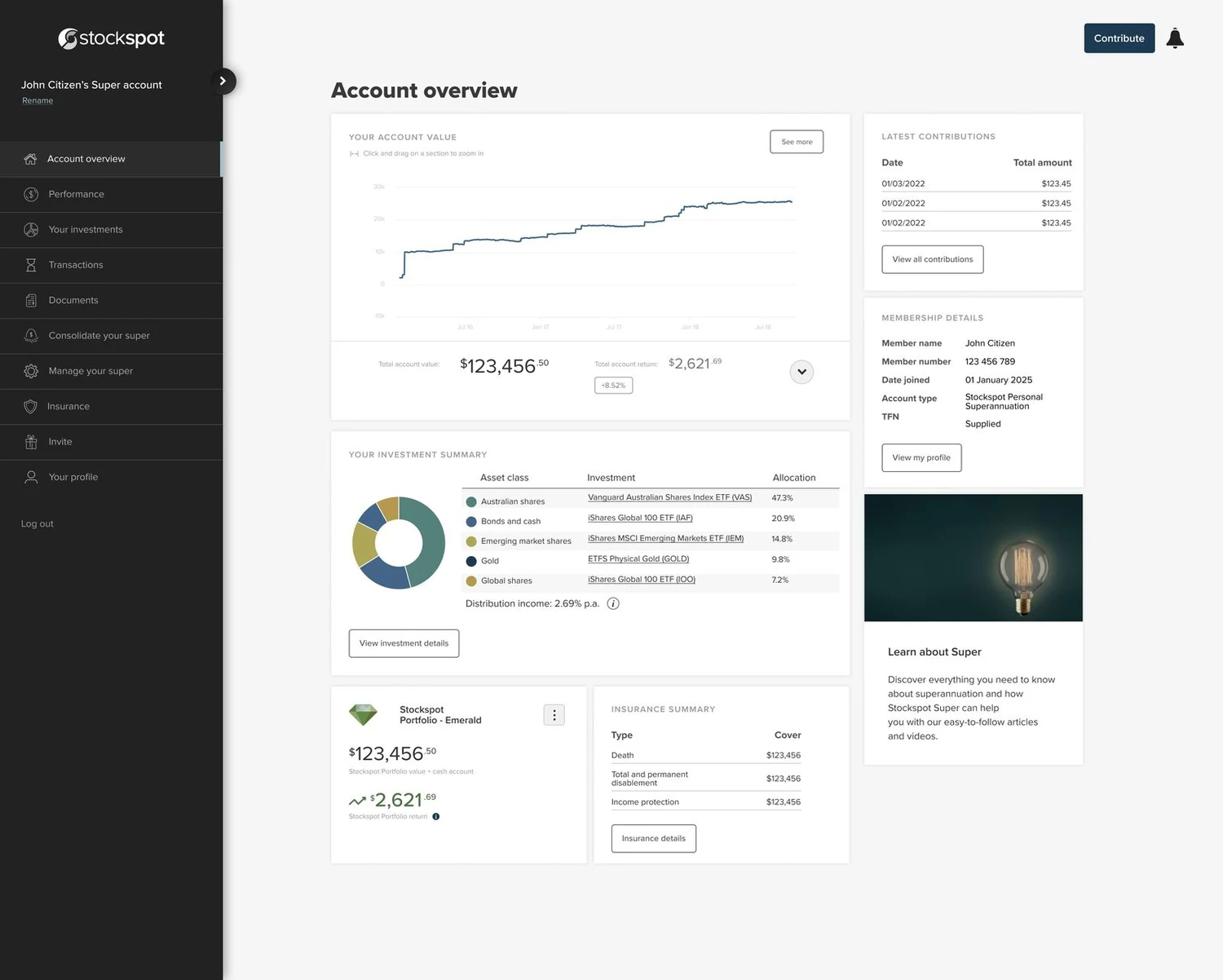
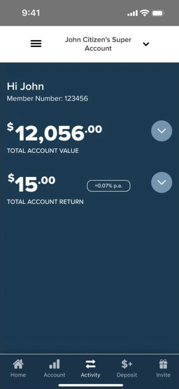
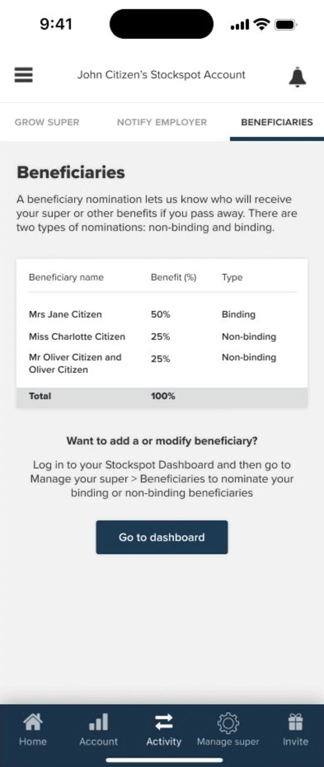
Four account states, from pending through to fully active, with around ten screens each. Desktop, mobile web and app each got their own sizing, layout and interaction rather than a responsive stretch.
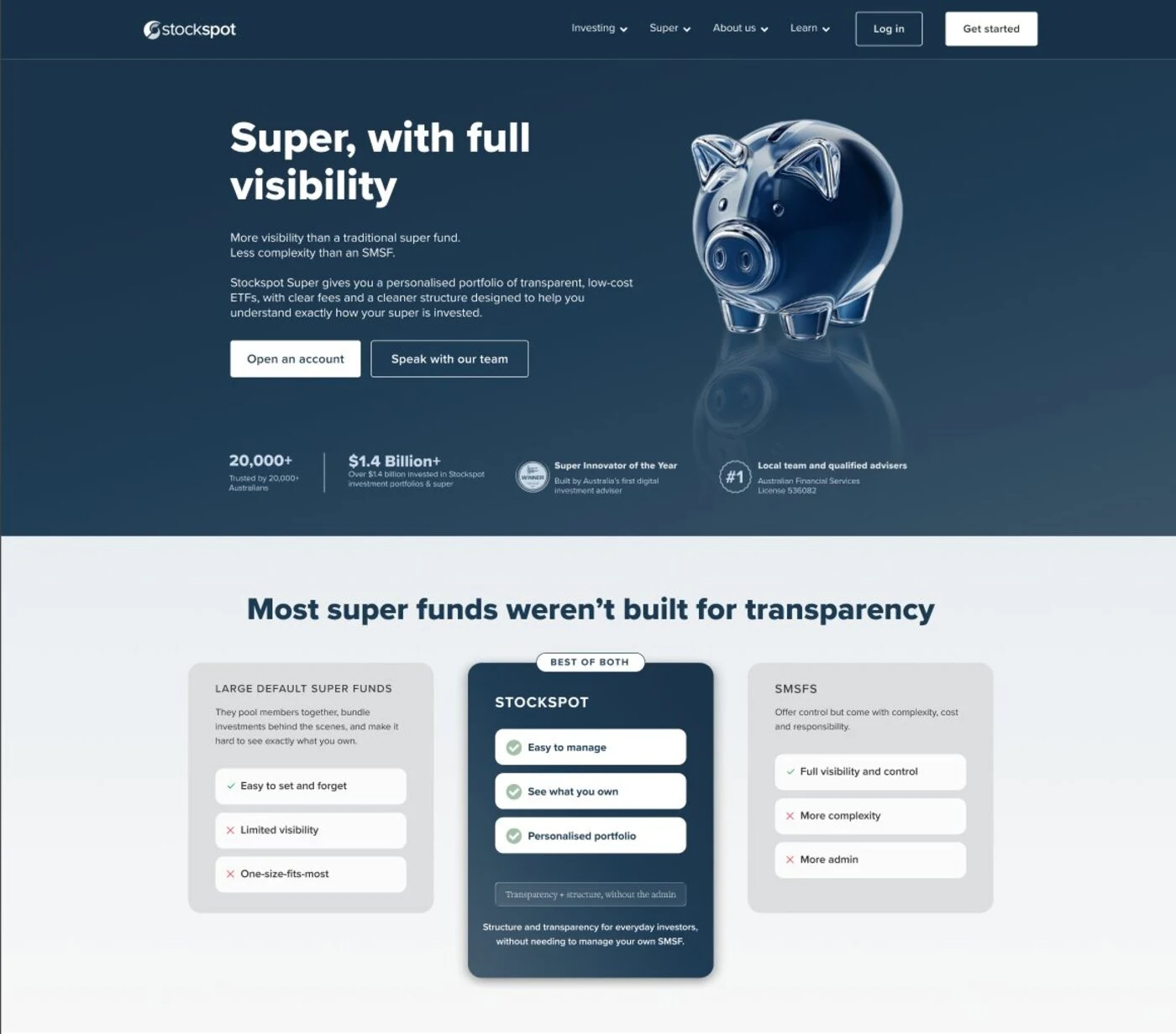
A marketing page to turn traffic into signups, explaining the value to people who had never heard of Stockspot Super.
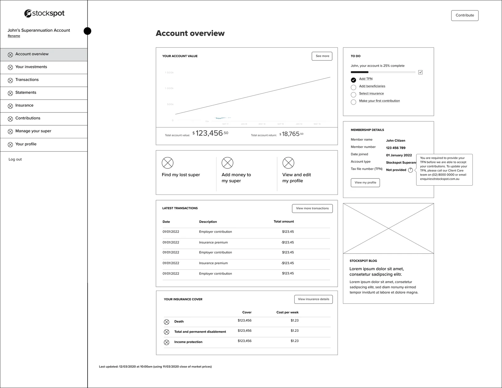
Competitor analysis across the big Australian super funds shaped the information architecture. From there it was wireframes, then prototypes, with the designs evolving right through build.
Once we had working flows, we sat down with users for interviews and watched them move through the product. Insurance was the clearest example of what came out of those sessions: people found that part of signup confusing and disjointed.
It wasn't obvious the cover came from a third-party insurer, so people weren't sure what they were agreeing to.
Made the third-party relationship clear from the very first screen.
The steps seemed to appear out of nowhere, so people lost track of where they were.
Trimmed the steps right back and showed them all upfront, so people knew what was coming before they started.
Setting expectations early made the whole flow feel calmer and more trustworthy. That loop of testing, listening and refining ran through the entire project, not just insurance.
A dashboard and app built around each account state, a lead-gen page with a direct path into signup, and a design system keeping every screen speaking the same language.
Protect time for research early
A tight timeline meant early decisions leaned on competitor examples, quantitative data and a small set of interviews. More insight up front would have caught friction we ended up fixing further down the track, and that's cheaper than reworking a shipped flow.
Set expectations before asking for effort
The insurance step didn't need fewer questions so much as a clearer picture of what was coming. Showing the whole path upfront changed how the same steps felt.
Turning interest in gold into a clear path to invest
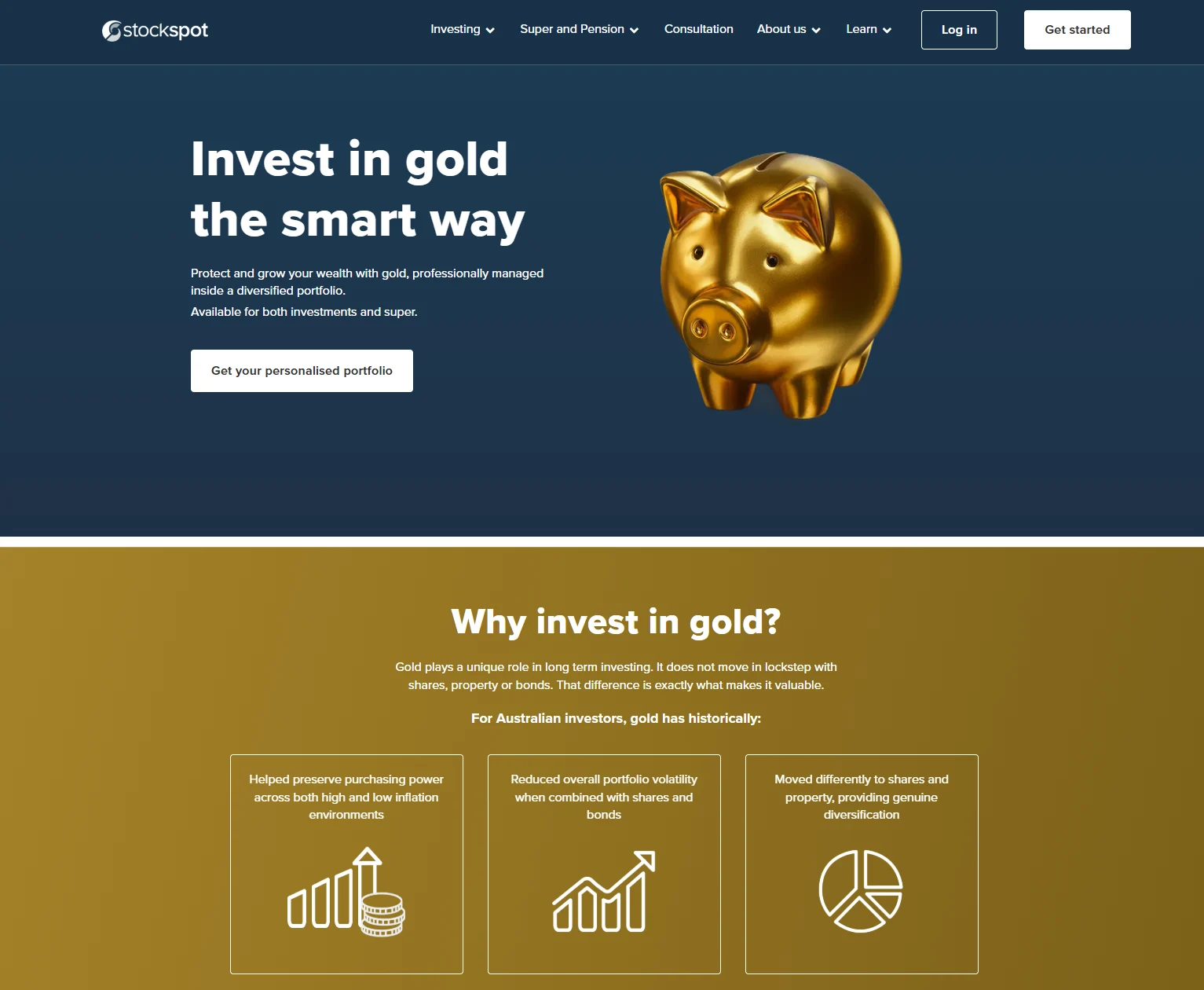
Gold's popularity spiked in Q4 2025 and people were looking for a way in. I pitched a dedicated Gold page to meet that interest, then shaped the journey from first touch through to signup, with the campaign built around it.
Stockspot portfolios already include gold ETFs as part of our diversification strategy. But people interested in gold often don't realise their portfolio or super can hold it, or that Stockspot does it automatically. The demand was there, with nowhere on our side that answered it.
The page became the home for all gold-related traffic, so every entry point lands in the same place. It works through three jobs in order: explain the role gold plays in a portfolio and in super, show that Stockspot already includes it, then guide people into Stockspot Portfolios or Stockspot Super depending on what they came for.
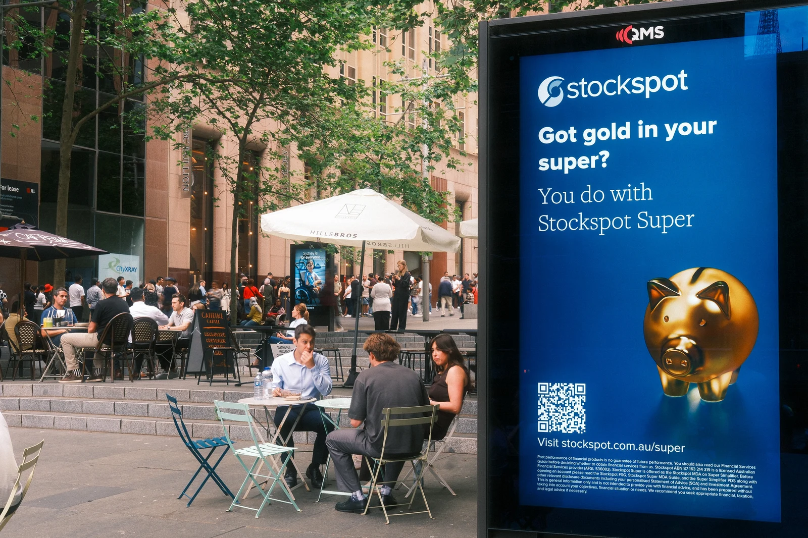
Screens outside the bullion dealer in Martin Place and through Perth Airport met people where they were, and a META suite carried the same message online.
Each entry point uses one gold-led visual system and leads with a simple provocation, "Most Australians don't invest in gold," and a clear value line, "gold exposure without the complexity." That way, landing on the Gold page feels like the next step rather than a new conversation.

The whole journey was built to answer a question: can seasonal, asset-led messaging build awareness and consideration with people who already value gold, and grow adoption of Stockspot Super over time?
One component library, kept in step with code
Rather than start Super from zero, I built its library on top of Stockspot's existing components, then kept it accurate as the product and codebase grew.
I kept the foundations and extended them for super: new navigation for tasks like consolidating and insurance, tabbed sub-navigation, and a contributions toggle. Super felt like Stockspot from day one.
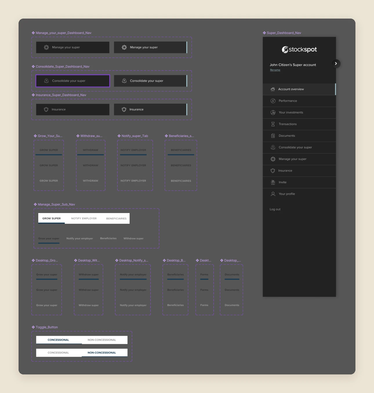
Every component is documented across each of its states, matched to the coded components, so design and engineering are always talking about the same thing.
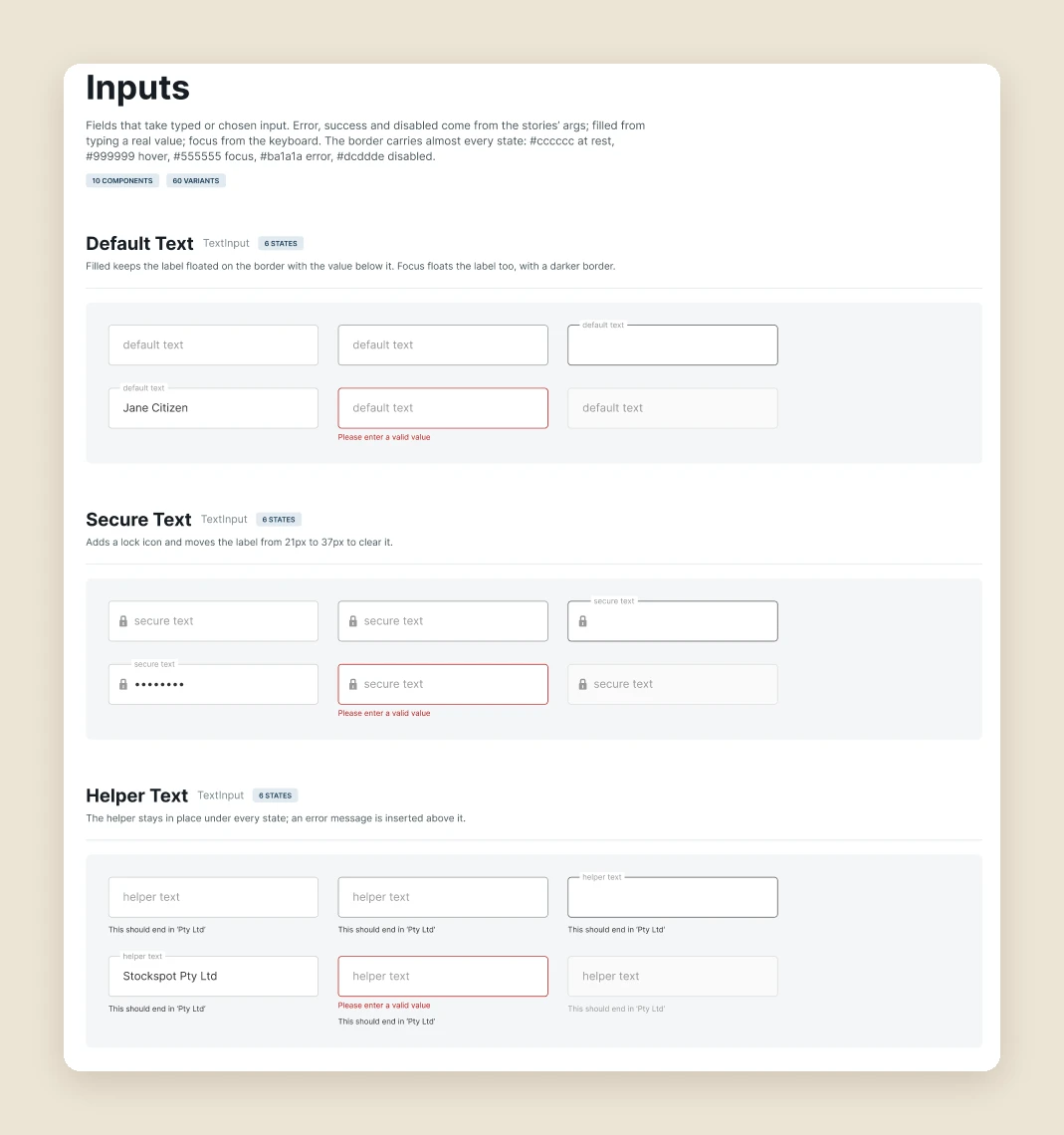
I use AI tools to help document components and roll updates through every variant, and work with our developers to fix inconsistencies in the library rather than screen by screen. It saves engineering time and stops the experience drifting.